Using Colored Boxes for Marketing
Color plays a vital role in marketing, influencing consumer behavior and brand perception. This guide explores color psychology, design principles, and how to use colored boxes for effective branding.
Summary
Using colored boxes for marketing is a strategic approach that leverages color psychology to influence consumer behavior, enhance brand identity, and improve market differentiation. Throughout history, color has played a pivotal role in marketing, with brands recognizing its ability to evoke emotions and shape perceptions. As consumerism evolved in the 20th century, companies systematically integrated color into their branding strategies, leading to the emergence of vibrant packaging that captures attention and fosters brand loyalty. Today, the effective use of color in packaging is critical for attracting customers in a competitive marketplace, making it a notable element of modern marketing practices.
The significance of color in marketing lies in its psychological impact; different hues can elicit distinct emotional responses and cultural associations. For instance, red is often linked to excitement, while blue conveys trust and security, making these colors effective in specific industries such as food and finance. However, marketers must navigate cultural variations in color interpretation to avoid miscommunication. As brands become more global, understanding these nuances is crucial for ensuring that color choices resonate positively with diverse audiences, thereby reinforcing brand messages rather than undermining them.
In the realm of packaging, colored boxes serve not only as a means of attracting consumer attention but also as an essential element of brand storytelling. Custom packaging designs that align with audience values can foster emotional connections, enhancing customer satisfaction and loyalty. The rise of e-commerce has further amplified the importance of standout packaging, with colorful designs encouraging social media sharing and organic brand promotion. However, marketers must balance vibrant color use with clarity, as excessive complexity can overwhelm consumers and dilute brand messages.
Despite its advantages, the use of color in marketing is not without controversies. Critics highlight that reliance on color associations can lead to misrepresentation, and the lack of universal meanings can complicate global marketing strategies. Additionally, while many studies suggest a correlation between color choice and consumer behavior, the evidence is not always definitive, with individual preferences and cultural contexts often modifying responses to color. As brands navigate these complexities, they must continually adapt their color strategies to align with evolving consumer expectations and market trends.
Historical Background
The use of color in marketing and branding can be traced back to ancient civilizations, where colors were not only aesthetic choices but also carried significant cultural meanings and symbolism. As marketing evolved, particularly during the 20th century, brands began to recognize the psychological impact of color on consumer behavior and purchasing decisions. Early studies highlighted that color could evoke emotions and associations that influence consumer perceptions and choices.
In the mid-20th century, with the rise of mass production and consumerism, companies began to employ more systematic approaches to color in their branding strategies. For instance, iconic brands like Campbell’s Soup embraced vibrant colors and distinctive packaging designs that resonated with nostalgia and familiarity, effectively capturing consumer attention on grocery store shelves. This era marked the beginning of using color as a deliberate marketing tool, as brands sought to differentiate themselves in an increasingly crowded marketplace.
The psychology of color gained further prominence in advertising literature throughout the late 20th century, with researchers documenting how various hues could elicit specific emotions and responses from consumers. For example, red is often associated with excitement and urgency, while blue conveys trust and calmness. These insights paved the way for brands to craft visual identities that aligned with their desired market positioning.
By the late 20th and early 21st centuries, the sophistication of color theory in marketing had grown exponentially. Marketers began to utilize advanced research methodologies to explore the cultural interpretations of colors, acknowledging that color meanings could vary significantly across different societies and contexts. This understanding reinforced the importance of tailoring color choices to the target demographic, ensuring that branding efforts resonate on a deeper cultural level.
Psychological Impact of Colors
Color psychology is a crucial aspect of marketing that examines how different hues affect human emotions, cognition, and behavior, thereby influencing consumer choices and brand perception. Various colors evoke distinct emotional responses and cultural meanings, which marketers must consider when designing branding strategies. For example, red can signify excitement and passion in some cultures, while in others, it may represent danger or aggression. This duality illustrates the importance of understanding cultural contexts to avoid misinterpretation and unintended associations.
Color and Market Differentiation
In a competitive marketplace, the choice of color can serve as a powerful differentiator for brands. Unique or unexpected color selections can enhance a brand’s memorability and capture consumer attention more effectively than conventional hues often used within an industry. Brands that leverage distinctive color schemes are more likely to stand out, thereby fostering a stronger visual identity.
Target Audience Alignment
Understanding the demographics and preferences of the target audience is essential for effective marketing. Different age groups, genders, and cultural backgrounds exhibit varying responses to colors, which can significantly impact consumer behavior. For instance, while pink may convey a sense of playfulness and femininity in some contexts, it can also be perceived as immature or weak in others. By aligning color choices with the values and preferences of their target audience, brands can establish more meaningful connections with consumers.
The Role of Colors in Branding
Colors not only affect emotions but also contribute to brand identity and recognition. For example, white is often associated with simplicity and elegance, as evidenced by brands like Apple and Dove, while blue communicates trust and security, commonly used by financial institutions. The psychological implications of color extend to consumer decision-making processes; research indicates that well-chosen colors can effectively attract attention and convey strong messages to potential customers.
Cultural Considerations in Color Perception
Cultural interpretations of colors vary widely, necessitating careful consideration in marketing strategies. For example, in certain cultures, white symbolizes happiness and purity, particularly in wedding traditions, while in others, it may represent mourning or misfortune. Marketers must navigate these nuances to ensure that color choices resonate positively with their intended audiences, reinforcing brand messages rather than detracting from them.
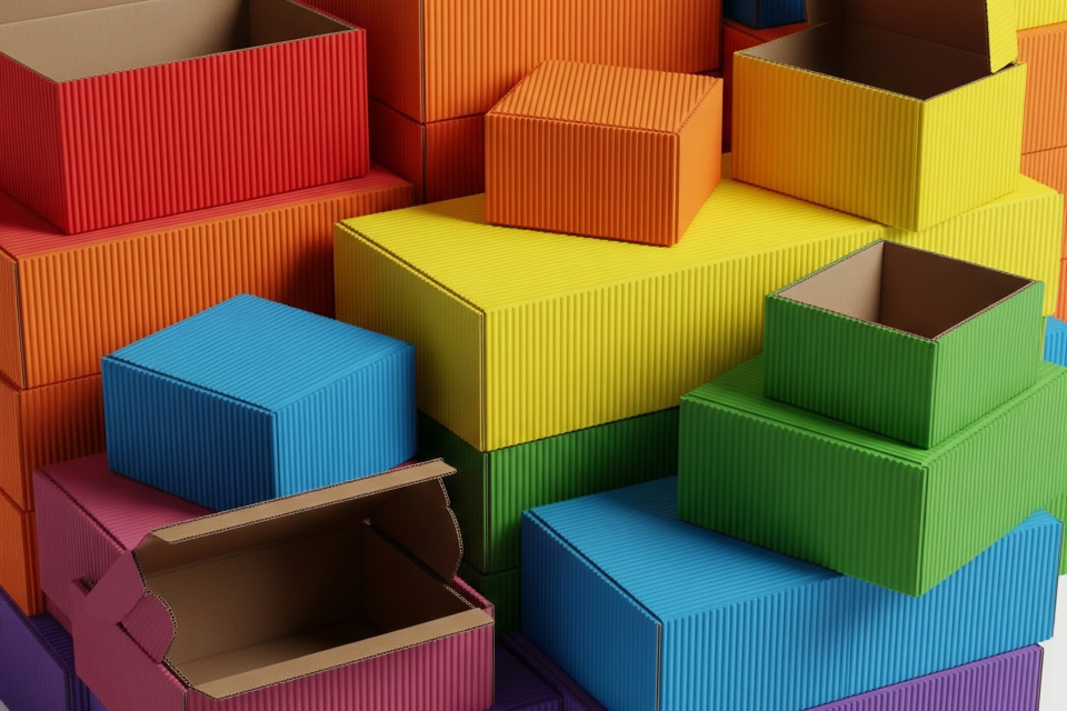
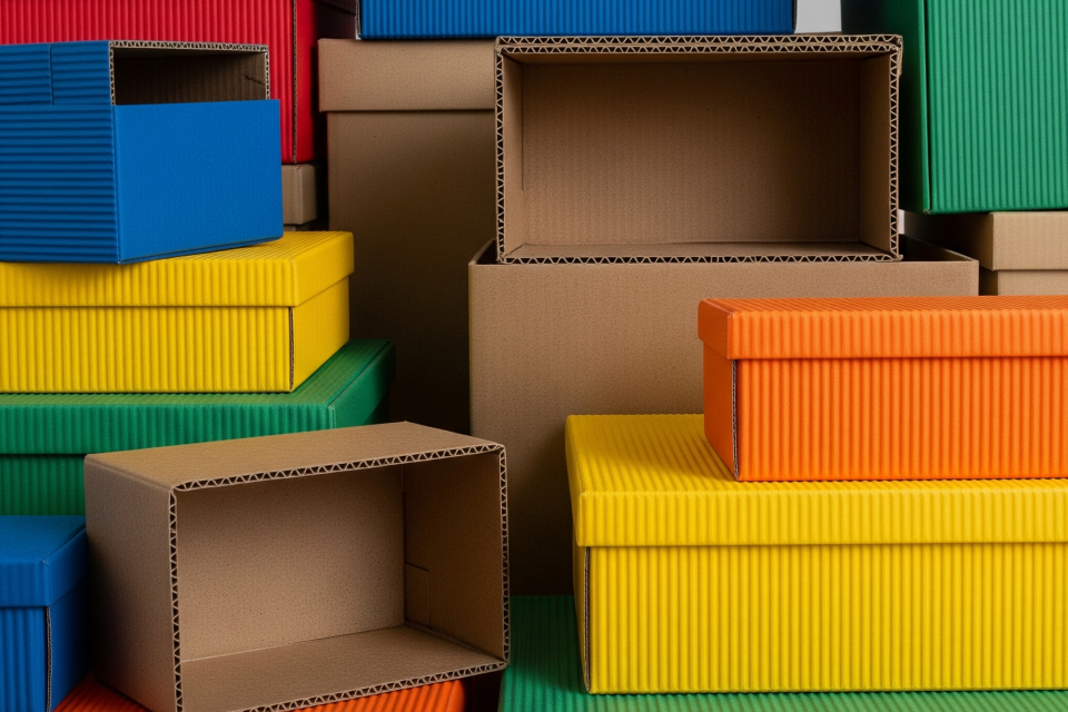
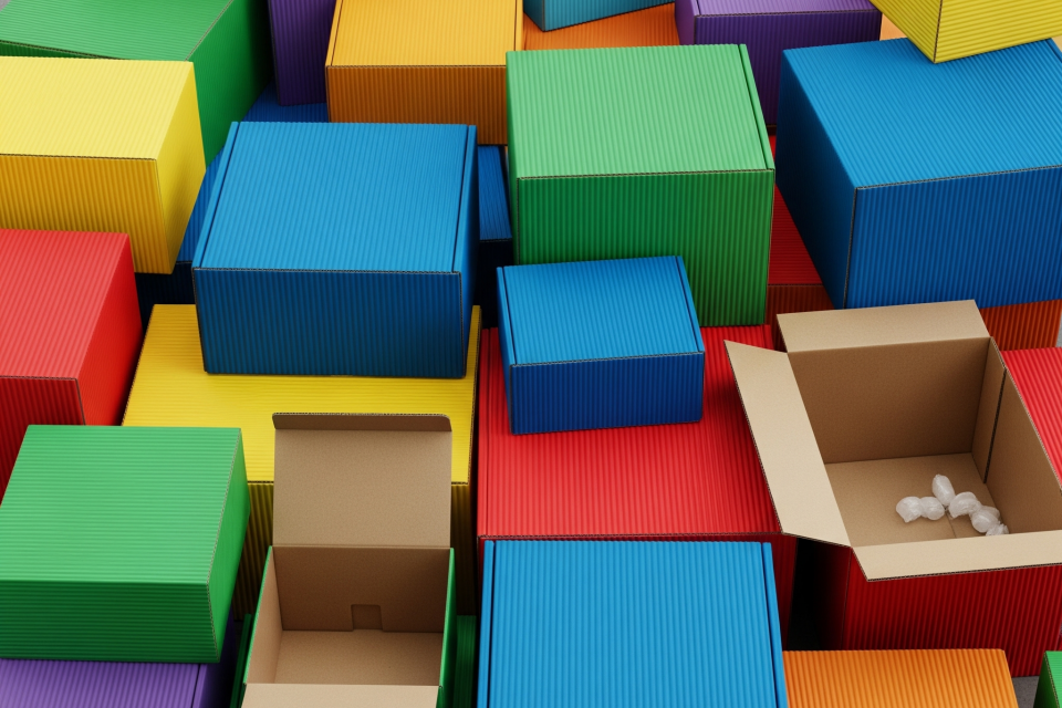
Types of Colored Boxes in Marketing
Custom Packaging Designs
Custom packaging designs play a vital role in marketing by creating emotional and cultural connections with consumers. Brands that align their aesthetic choices with audience values often foster stronger loyalty. For example, the use of soft pastels in cosmetic packaging conveys sophistication and delicacy, appealing to the target market’s desire for elegance. In contrast, bold colors like red and yellow in snack and beverage packaging communicate energy and excitement, while earthy tones in eco-friendly products emphasize sustainability and authenticity.
Standout Packaging
Standout packaging not only enhances the unboxing experience but also encourages social media sharing. Customers often post unboxing videos when they receive colorful mailers, expanding brand reach organically. Brands like Glossier utilize bright pink shipping boxes, creating a memorable brand identity, while ASOS employs vibrant motifs to amplify customer engagement online. This marketing strategy contributes to higher customer satisfaction and loyalty, as consumers are delighted by the unique presentation of their purchases.
Strategic Color Choices
Choosing the right colors for decorative paperboard boxes is essential for reflecting a brand’s mission and values. For instance, brands like Meyers use green hues to signify their commitment to environmental sustainability, which resonates with eco-conscious consumers. Seasonal and promotional color strategies can also enhance brand visibility and recognition on digital platforms, where visually appealing content thrives.
Innovations in Packaging
As technology evolves, dynamic color strategies are becoming increasingly important. Innovations such as interactive packaging with augmented reality features engage consumers in immersive experiences that strengthen brand loyalty. These advancements allow businesses to connect with audiences on a deeper level, utilizing color psychology and technological tools to create captivating marketing strategies.
Key Takeaways from Successful Campaigns
Effective marketing through colored boxes revolves around several key takeaways: Emphasizing brand identity through consistent color palettes aids recall. Creating anticipation with attention-grabbing designs builds excitement before the product is even opened. Leveraging color psychology can significantly impact consumer perception and purchasing decisions, ultimately driving sales and enhancing brand recognition in competitive markets.
Case Studies
The strategic use of colored boxes in marketing has been demonstrated through various case studies that highlight the impact of packaging design on consumer behavior and brand loyalty.
Successful E-commerce Examples
Several prominent e-commerce brands have effectively leveraged colorful packaging to enhance customer satisfaction and encourage social sharing. For instance, Glossier is renowned for its bright pink shipping boxes, which create a memorable unboxing experience and foster a sense of connection with customers. Similarly, ASOS employs vibrant motifs in their packaging, which not only delights recipients but also generates buzz on social media platforms as customers share their unboxing moments.
Insights from Specific Case Studies
Nestle Sweet Success One notable case study is Nestle’s “Sweet Success,” a weight-loss product centered around chocolate beverages. This case study provides an in-depth look at the packaging development process, from initial sketches to the final product presentation, showcasing how thoughtful design contributes to a product’s appeal and market performance.
Fruit Cider by Tubik Agency Another compelling example is the fruit cider brand designed by Tubik Agency. This study reveals the creative process behind packaging design and marketing graphics, illustrating how a distinctive aesthetic can capture consumer interest and enhance brand identity.
Theoretical Implications and Consumer Behavior
Research indicates that color choice in packaging significantly influences consumer purchase intentions. A study explored the interaction effects of color and food type, highlighting how warm versus cool colors can sway consumer decisions. This aligns with findings in color psychology, which suggest that specific hues can evoke distinct emotional responses, thereby impacting brand perception and consumer loyalty. Brands that understand and implement effective color strategies can create packaging that resonates with their target audience, leading to improved market performance.
Lessons Learned
Key takeaways from these case studies emphasize the importance of aligning packaging colors with brand identity, creating anticipation through unique designs, and understanding the emotional responses elicited by different hues. As seen in successful campaigns, brands that focus on these elements not only enhance customer experience but also strengthen their market position.
Design Principles
When designing colored boxes for marketing, it is crucial to adopt effective design principles that not only attract consumers but also communicate brand identity and values. Two of the most significant elements in this regard are color and typography, both of which have profound psychological impacts on consumer decision-making processes.
Color Usage
Color serves as a powerful tool in creating a visual hierarchy that can guide the viewer’s attention and emphasize essential brand messages. The selection of colors can evoke specific emotions and forge connections with the audience. For instance, warm colors like red and orange may generate excitement, while cooler shades like blue and green inspire trust and calmness.
Color Schemes
Designers often utilize various color schemes to enhance their packaging:
- Monochromatic Scheme: This approach involves using different shades and tints of a single color, creating a clean and sophisticated look.
- Analogous Colors: Choosing colors that sit next to each other on the color wheel, such as blue, green, and teal, produces a harmonious and pleasing aesthetic.
- Complementary Colors: Utilizing colors opposite each other on the color wheel, such as blue and orange, can create a vibrant and striking contrast that captures attention.
- Limiting the palette to two or three colors is advisable to prevent overwhelming potential customers while maintaining brand recognition.
Typography
Typography is equally essential in the design process. The right font choices can effectively showcase product features and communicate brand identity. Simple text combined with thoughtfully applied colors can make the packaging more engaging for consumers, catering to their expectations based on the product category-high-tech products may demand a more modern aesthetic, while cosmetics packaging often relies on elegance and allure.
Sustainability Considerations
In recent years, there has been a shift towards sustainable design practices. Consumers are increasingly concerned about environmental impacts, prompting designers to adopt minimal material usage, biodegradable packaging, and eco-friendly inks. Effective packaging should not only prioritize aesthetics but also consider functionality, such as ease of use, to enhance the customer experience and minimize frustration during unboxing.
Criticisms and Limitations
Despite the significant impact of color in marketing and packaging, there are criticisms and limitations associated with its application.
Misrepresentation and Overgeneralization
One of the primary criticisms is that color associations can lead to misrepresentation. While certain colors are commonly linked to specific emotions or product categories-such as red evoking appetite in food products and blue suggesting purity in health and beauty items-these associations are not universal. Cultural differences can significantly alter the meanings of colors, meaning that a color that resonates positively in one culture may have a negative connotation in another. This variability complicates the use of color psychology in a global marketplace, as marketers must be aware of and adapt to these cultural distinctions to avoid alienating potential consumers.
Overwhelming Visual Complexity
Another limitation is the risk of overwhelming consumers through excessive color use in packaging design. While vibrant colors can attract attention, using too many different hues can create visual chaos, leading to consumer disinterest or confusion. Striking the right balance is crucial; packaging must be eye-catching without detracting from the product’s main message. The challenge lies in creating a harmonious design that effectively utilizes color to enhance product appeal while maintaining clarity.
Lack of Definitive Evidence
Moreover, the effectiveness of color psychology is sometimes debated due to a lack of definitive evidence. While numerous studies suggest that colors can influence consumer behavior and purchase decisions, the results can be inconsistent and context-dependent. Factors such as personal preferences, brand familiarity, and product type can all modify how color is perceived and reacted to by consumers. As such, marketers may find it challenging to predict outcomes based solely on color choices.
Design and Branding Constraints
Lastly, businesses may face constraints in design and branding choices when attempting to utilize color effectively. Poor design and branding decisions-like using outdated graphics or inconsistent branding elements-can undermine the advantages gained from effective color use. If packaging fails to resonate aesthetically or contextually, it can detract from the product’s value and even harm brand perception.
Future Trends
Evolving Color Strategies in Packaging
As the packaging industry moves forward, the strategic use of color is becoming increasingly crucial for brands aiming to capture consumer attention and enhance their market presence. For 2024 and beyond, there is an anticipated shift towards more bold and vibrant colors, with brands leveraging bright hues to create memorable packaging experiences that stand out on retail shelves. In contrast, softer pastel shades are also expected to maintain popularity, appealing to minimalist aesthetics and providing a calming effect for consumers.
Balancing Trends with Brand Identity
While keeping abreast of color trends is important, brands must also consider their core identity and values when selecting color schemes. Adapting current trends in a manner that complements a brand’s ethos-such as using modern gradients in earthy tones for eco-friendly brands-can foster consumer connection and loyalty. This balance allows brands to stay relevant without overshadowing their established messaging or values.
Psychological Impact of Color
Understanding the psychological implications of color remains pivotal for influencing consumer behavior. Different colors can evoke specific emotions: red often conveys excitement and urgency, while blue instills trust and calmness, particularly relevant for corporate and technology products. Brands that harness the emotional power of color can effectively communicate their core messages and enhance their products’ appeal, influencing purchasing decisions in a competitive market.
Integration of Smart Technology
In conjunction with evolving color trends, the integration of smart technology into packaging design is expected to enhance the consumer experience. Innovations such as QR codes and NFC chips are transforming packaging into an interactive medium, fostering deeper engagement and providing additional layers of information that can complement visual color strategies. This synergy between color and technology not only enriches consumer interaction but also aligns with the broader industry trend towards sustainability and functionality.