Método de Cor no Estilo de Embalagem de Perfume Feminino
Well-regarded developer Christian Dior perceptively specified that perfume functions as a gateway to a completely new experiential realm. He additionally insisted taht fragrance makes up a vital part of a female's identity, synergizing with style to grow allure.
Introdução
O conceituado criador Christian Dior perspicazmente especificou que o perfume funciona como uma porta de entrada para um reino experiencial completamente novo. Ele também insistiu que a fragrância constitui uma parte vital da identidade feminina, sinergizando com o estilo para aumentar o fascínio. Uma parte significativa das mulheres urbanas contemporâneas demonstram uma profunda afinidade por aromas. Os perfumes detêm um nível de valor semelhante a gemas preciosas. No domínio de embalagens de produtos de fragrância feminina , a cor constitui o principal estímulo estético que envolve o cliente. A aplicação calculada da tonalidade em embalagens de perfume deve verbalizar a estrutura fundamental do artigo, especificar as suas características únicas e subtilmente transmitir a sua conotação ou história subjacente. Este artigo examinará cientificamente a função essencial da tonalidade na formação de pressupostos sobre embalagens de produtos de perfume feminino , especialmente quando apresentada como uma caixa de presente extravagante . Certamente exploraremos como a cor afeta a escolha do consumidor e a identificação da marca.

O Efeito Neurológico e Mental da Cor
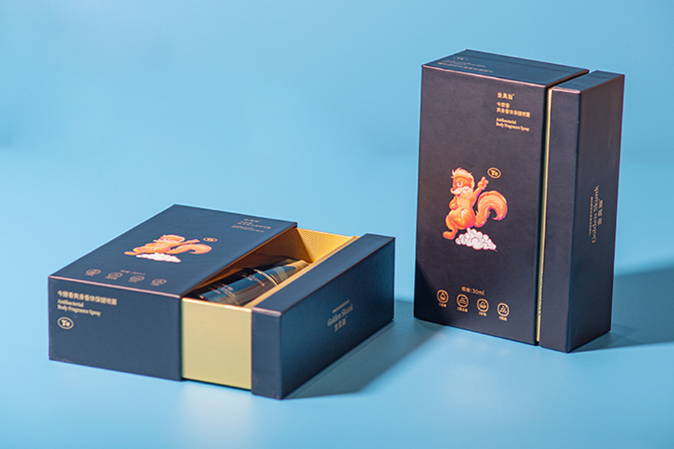
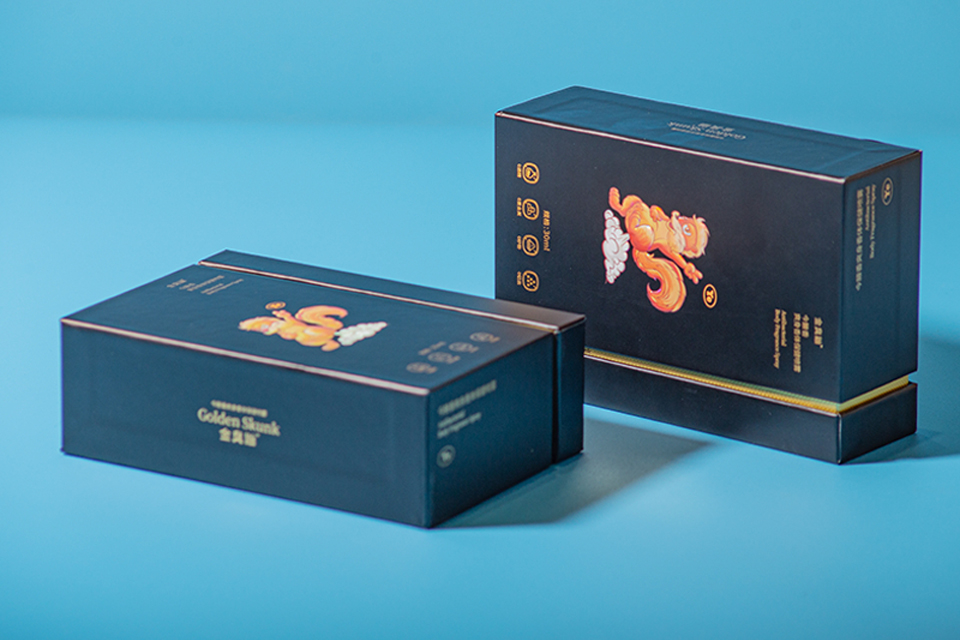
A perceção da tonalidade influencia fundamentalmente a emoção e a cognição humanas. A mente refina as pistas estéticas de tonalidade com uma velocidade impressionante, ativando respostas associativas. Em embalagens de fragrâncias femininas , combinações de cores particulares podem estimular estados mentais distintos ou indicar perfis de fragrâncias particulares. Como exemplo, tons pastel suaves, como rosas coradas, lavandas ou verdes-menta, regularmente se conectam com especial, romance e subtileza. Estes tons frequentemente embelezam embalagens de produtos de perfume para fragrâncias florais ou leves e ventiladas. Alternativamente, cores vivas e saturadas como fúcsia, azul elétrico ou amarelos vibrantes transmitem poder, confiança e modernidade. Tais cores podem se adequar a aromas vibrantes, frutados ou progressivos. Tons metálicos – ouro, prata, ouro subido ou bronze – representam consistentemente o high-end, a opulência e a exclusividade. Estes são elementos básicos em embalagens de fragrâncias femininas de alta qualidade embalagens de fragrâncias femininas de alta qualidade , impulsionando o posicionamento premium do artigo. A escolha cuidada destas cores desenvolve uma linguagem não-verbal, falando diretamente para os desejos e expectativas sensoriais do consumidor. Compreender esta interação psicológica é crucial para uma eficiente embalagens de perfume design.
Transparência do Produto: Interação de Líquido, Vidro e Luz
Os fabricantes frequentemente criam frascos de perfume em vidro transparente. Esta seleção de material é deliberada. A clareza inerente e a qualidade cristalina do vidro recomendam naturalmente pureza, refinamento e alto valor aos consumidores. Esta transparência permite que a verdadeira cor do fluido do perfume se torne parte indispensável da apresentação estética total do frasco de perfume feminino . Muitos perfumes em si têm cores atraentes, variando de vinhos espumantes pálidos e rosas rosados a amarelos-acastanhados abundantes e até azuis ou verdes profundos. O recipiente de vidro serve como uma lente, refratando a luz e exibindo o tom do fluido, que pode mover-se e brilhar sutilmente. Este dinamismo visual acrescenta à preciosidade percebida. Consequentemente, o exterior embalagem de fragrâncias , geralmente uma caixa rígida ou dobrável Caixa de Presente , precisa equilibrar-se com o recipiente transparente e o líquido colorido no seu interior. O padrão de cor da caixa deve combinar, não colidir, com a tonalidade intrínseca da fragrância, produzindo um conjunto natural e visualmente agradável. Esta sincronização cuidadosa intensifica a atração.
Strategic Shade Palettes for Women Perfume PResent Boxes
Designers often choose light-colored palettes for female perfume packaging boxes. This preference is not arbitrary. Light colors, including whites, creams, soft grays, and light pastels, often tend to stimulate feelings of tidiness, beauty, and meekness. In the context of a Caixa de Presente , these shades also communicate celebration, consideration, and a sense of unique event. Darker shades, while occasionally made use of for remarkable effect in specific niche or unisex scents, can periodically evoke unintended sad or heavy feelings if not expertly handled in mainstream embalagens de produtos de fragrância feminina . The purpose is usually to develop a feeling of aspirational lightness and elegance. The embalagens de perfume intends to thrill the recipient. Consequently, shade choices that advertise favorable psychological feedbacks are normally preferred. Package works as the very first responsive and aesthetic interaction, setting the stage for the scent experience itself.
Color Solutions and Brand Identification Communication
Developing a regular and identifiable color system is extremely important for developing brand name identity in the competitive embalagens de produtos de perfume feminino market. This involves producing shade harmony throughout numerous touchpoints. The primary color of the fragrance liquid, the tint or clearness of the bottle, the leading shades of the extravagante , and also additional product packaging elements like bows or cells paper need to align with a defined brand name scheme. Strategic color selections assist consumers instantaneously recognize a brand name or a specific product on congested retail shelves. For instance, Chanel No. 5’s renowned black, white, and gold palette is instantly recognizable and associated with timeless deluxe. Some brands take on trademark shades that end up being fundamentally connected to their identity, enhancing brand recall. While color trends can influence seasonal or limited-edition embalagens de perfume , core brand shades typically provide a structure of stability and acknowledgment, ensuring that the embalagens de fragrâncias femininas de alta qualidade constantly reflects the brand name’s values.
Advanced Shade Applications and Tactile Finishes
The effect of color in women fragrance product packaging extends beyond simple flat hues. Advanced printing methods and material finishes significantly magnify the sensory experience and viewed worth of a Caixa de Presente . For example, foil marking, applying metallic or pigmented foils in certain colors like gold, silver, and even vivid blues or pinks, presents highlights and luxurious accents. Embossing or debossing colored logo designs or patterns develops tactile interest and visual deepness. Special varnishes, such as place UV gloss, can ensure tinted locations “pop” with high shine, contrasting with a matte history. Pearlescent or iridescent finishes can provide the embalagens de perfume a refined glimmer that alters with light and motion, including a spiritual high quality. The choice of paper or board material itself, whether textured, subtly colored, or sustainably sourced, additionally communicates with the applied shades. These innovative applications transform the female perfume product packaging from a plain container right into a multi-sensory art object, boosting its allure as a premium extravagante .
Color as an Allegory for Olfactory Experience
Effective embalagens de produtos de perfume layout makes use of shade as an effective symbolic tool to connect the significance of the fragrance itself. This requires a nuanced understanding of synesthesia– the blending of detects– where shades can stimulate particular scents or state of minds. An attentively developed extravagante para embalagens de produtos de perfume feminino commonly utilizes color schemes and imagery that aesthetically analyze the perfume’s olfactive household. As an example, verdant eco-friendlies and sky blues on fragrance product packaging might recommend fresh, water, or herbal notes. Warm brownish-yellows, crimsons, or rich browns can visually equate to asian, spicy, or gastronomist fragrances. Delicate pinks, luscious whites, and soft yellows, often accompanied by floral illustrations, clearly indicate flower bouquets. Graphic aspects, such as creative makings of flowers, fruits, or abstract patterns in certain color mixes, additionally strengthen this olfactory message. The fragrance product packaging therefore becomes a visual overture to the aroma.
Fragrance’s Evolution and the Peak of the Present Box
Perfume’s trip with history is fascinating. Initially, some historic accounts recommend Europeans developed scents partly to mask body odors in ages of less constant showering. Today, however, fragrance’s social role has progressed considerably. It is currently totally related to concepts of feminineness, individual expression, love, and adavanced deluxe. Fragrance regularly functions as a treasured token of affection, making it one of the most preferred gift options for females. In this context, the relevance of embalagens de produtos de perfume feminino as a high-value extravagante can not be overemphasized. The product packaging does more than shield the precious materials; it boosts the whole gifting ritual. THe colors, products, and style of the fragrance product packaging add substantially to the regarded worth and psychological impact of the gift. It comes to be a tangible expression of the giver’s esteem and the recipient’s worth.
Veredicto
Color stands as an indispensable and highly influential element in the layout and advertising and marketing of embalagens de fragrâncias femininas . Strategic color option greatly affects customer understanding, communicates brand name identification, and can also metaphorically suggest the scent’s olfactory profile. From the mental organizations evoked by details shades to the interplay of light with clear bottles and the tactile experience of the Caixa de Presente , color manages a multi-sensory narrative. The careful harmonization of shade throughout all components of embalagens de perfume enhances its appeal and charm. Ultimately, color is not merely a decorative element; it is a critical communication tool thta transforms the female perfume product packaging right into a compelling declaration of appeal, high-end, and emotion, solidifying its standing as a premier Caixa de Presente .